Understanding the perceptions of prospective students and supporting them in making the right study choice is no easy task. At Hogeschool Utrecht (HU), we focused on improving the student journey to better serve this target group.
CHALLENGE
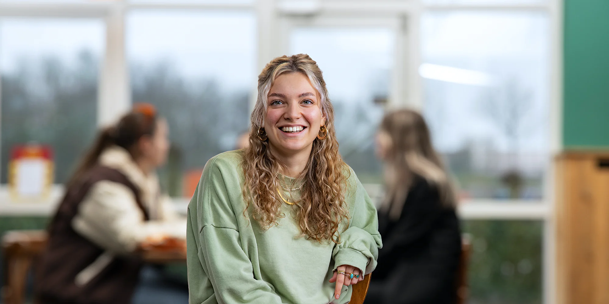
How do you reach Gen Z?
To provide effective and understandable information to the target audience, it was crucial to provide clear information in a way that matched their preferences. But how could we effectively reach this target audience, Gen Z, and provide understandable information? This challenge had us thinking about visual language and how content should be written and created.
APPROACH
Less text is more telling


SOLUTION
Connect to the mental model
During the sketches and explorations, we quickly noticed that the student journey was not a linear process. It included several leads and choice moments that were intertwined. Therefore, we chose to define three main phases: "I have no idea yet," "I am still in doubt," and "I am sure." Within each phase, we categorized relevant information and created landmarks that fit the target audience's mental model.
To better serve the target audience, we designed several patterns that are common on social media platforms, such as the ability to view information in a narrative environment, similar to stories in Instagram.
During the process, we also saw an opportunity to address discoverability directly. So I redesigned the information architecture and improved the main navigation so that important information was more quickly accessible to the user.
RESULTS
Lots of video, lots of images
All the information is summarized in three clear pages, where we mainly use short texts and lots of video to serve the young visitors. We spent considerable time designing the visual language of the pages as well as their content.
A walkthrough the pages with all phases.

The stages
The stages the prospective student is in is translated into 3 page; I don't know yet, I'm still in doubt and I'm almost sure. For each page we connect to the mental model on which the user sits in his process.
New navigation
The revamped navigation is serviceable and clear, allowing all user types to access information faster compared to the previous version.
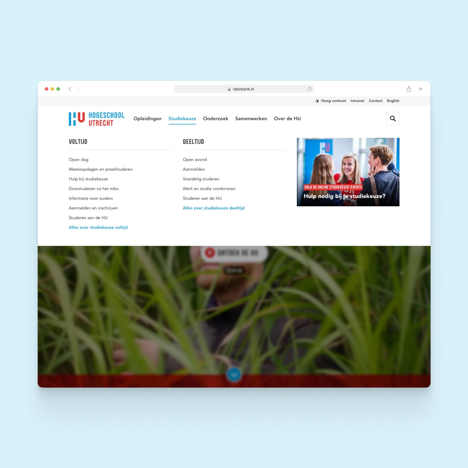

Site structure
Many pages have been rearranged based on the needs of different user types. This allowed us to create significantly more overview and increase findability.
Award winning

LEARNINGS
Design realistically
During the project we had important learning moments. For example, we learned that finding the right balance between design and technical feasibility was a challenge. We wanted to use interaction patterns like those of Instagram, but this turned out to be technically difficult to achieve within the allotted time. We had to make choices and keep the balance between the final design, technical feasibility and a story as clear as possible for the users.
Project details
Client
Hogeschool Utrecht
Year
2021 — 2022
Collaboration
Eight
My role
UX Designer
Skills
UX Design
Visual Design
Prototyping
Tooling
Figma
Sketch

