
Responsible loans, that's what Freo stands for. With the challenge of ensuring that customers cannot simply apply for a loan while expecting convenience and speed in the process. Together with a team at Freo, I took this application journey in hand.
CHALLENGE
The balance in cognitive load
Balancing the cognitive load was an important issue in optimizing the application process at Freo. Although there was a demand from legislation and the business for more friction in the process, we wanted to ensure that prospects could request a quotation without too much effort. This would allow for faster review of requests, with higher quality as a benefit. We faced several challenges:
High cognitive load
Users experienced difficulties filling out the application due to the large amount of information.
More extensive from
Due to legal requirements and business goals, the form had to be expanded by at least double the number of questions.
Lack of transparancy
Users distrusted the process because it was not clear why certain information had to be provided.
APPROACH
Insightful improvement
Based on previous research, we already had a lot of information to understand the problem. To address any blind spots, we conducted additional research to fully map the mental model.
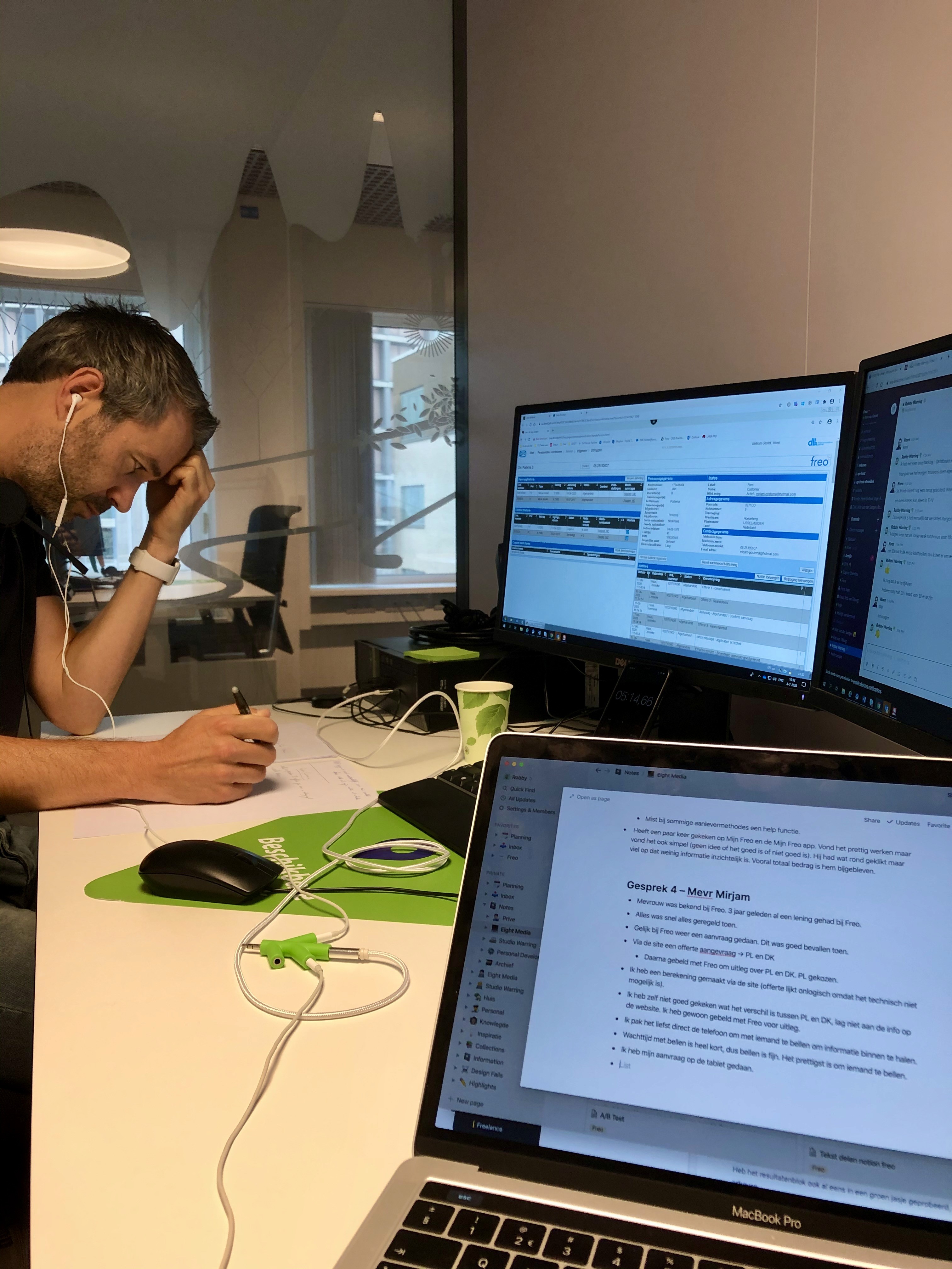
Interviews
We conducted telephone interviews with clients who had recently gone through the process. With this, we wanted to find out where the pain points were and what needs there were.
Usability testing
We conducted user testing sessions to observe how users went through the entire application process. This gave us quick insight into process bottlenecks.

Iterative workflow without wireframes
To quickly test assumptions with users, we chose to skip the wireframe process. However, since large parts of the process were redesigned, we were still able to use many existing components. By prototyping directly in visual design, we were able to develop a testable product faster.
SOLUTION
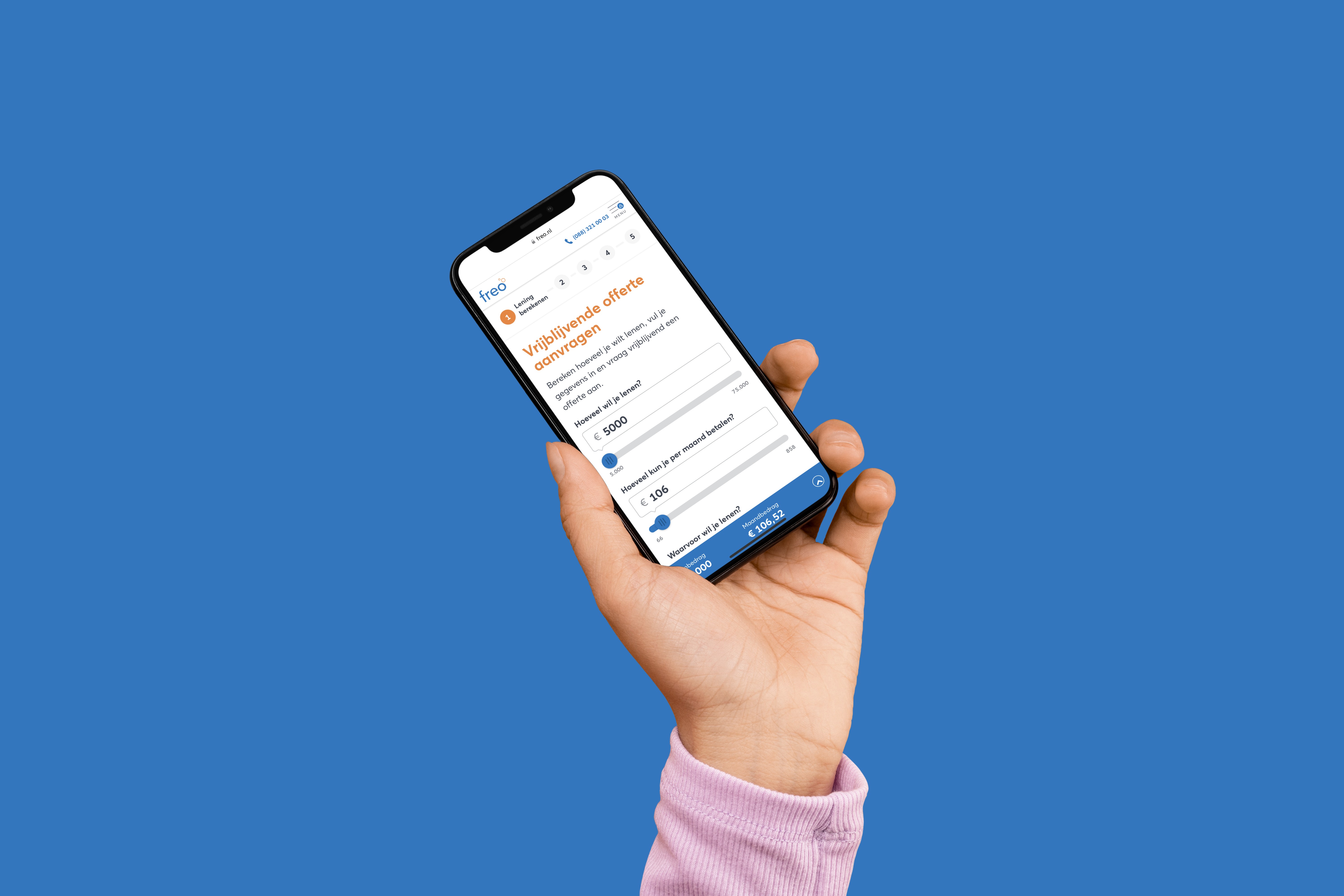
Take the user by the hand
After several iterations, I found that showing the form in fragments was the best approach. Therefore, I divided all the questions into categories and subcategories. Each time, the user is shown only a subcategory, with the questions displayed conditionally. This provides more focus.
Small chunks of information
At each step, users are shown only a few questions. After completion, the form unfolds and new questions are displayed.
Transparency gives confidence
Clear and straightforward communication helps users know where they stand faster. Some questions are privacy-sensitive, so I designed a modal to provide additional context.
Mobile first
More than 60% of quote requests are made on mobile devices. Therefore, I redesigned all form elements so that they are easy and intuitive to use on both mobile and desktop.
RESULTS
Quality went up
The new form was rolled out incrementally so that the impact of the change could be properly monitored. It soon became clear that the new form was having a positive impact.
Cognitive load down
Subsequent user testing showed that the load while filling out the form was reduced.
More net applications
Despite a decrease in gross requests, the percentage of net requests increased.
Higher quality
The quality of completed forms improved, resulting in fewer interruptions in the process due to errors in the data provided.
LEARNINGS
Keep in touch with your users
The quote form is Freo's most important page. Because a major change can also be disastrous for conversion, it was necessary to obtain certainty before each change was implemented. Therefore, I chose to conduct regular tests with users. This provided new insights and gave confidence in the approach and design choices.
Project details
Client
Freo Rabobank
Year
2020 — 2022
Collaboration
Eight / Freo Internal Team
My role
UX Designer
Skills
UX Research
UX Design
Visual Design
Prototyping
Tooling
Figma
Sketch
InVision
Usabillity Testing
Interviews